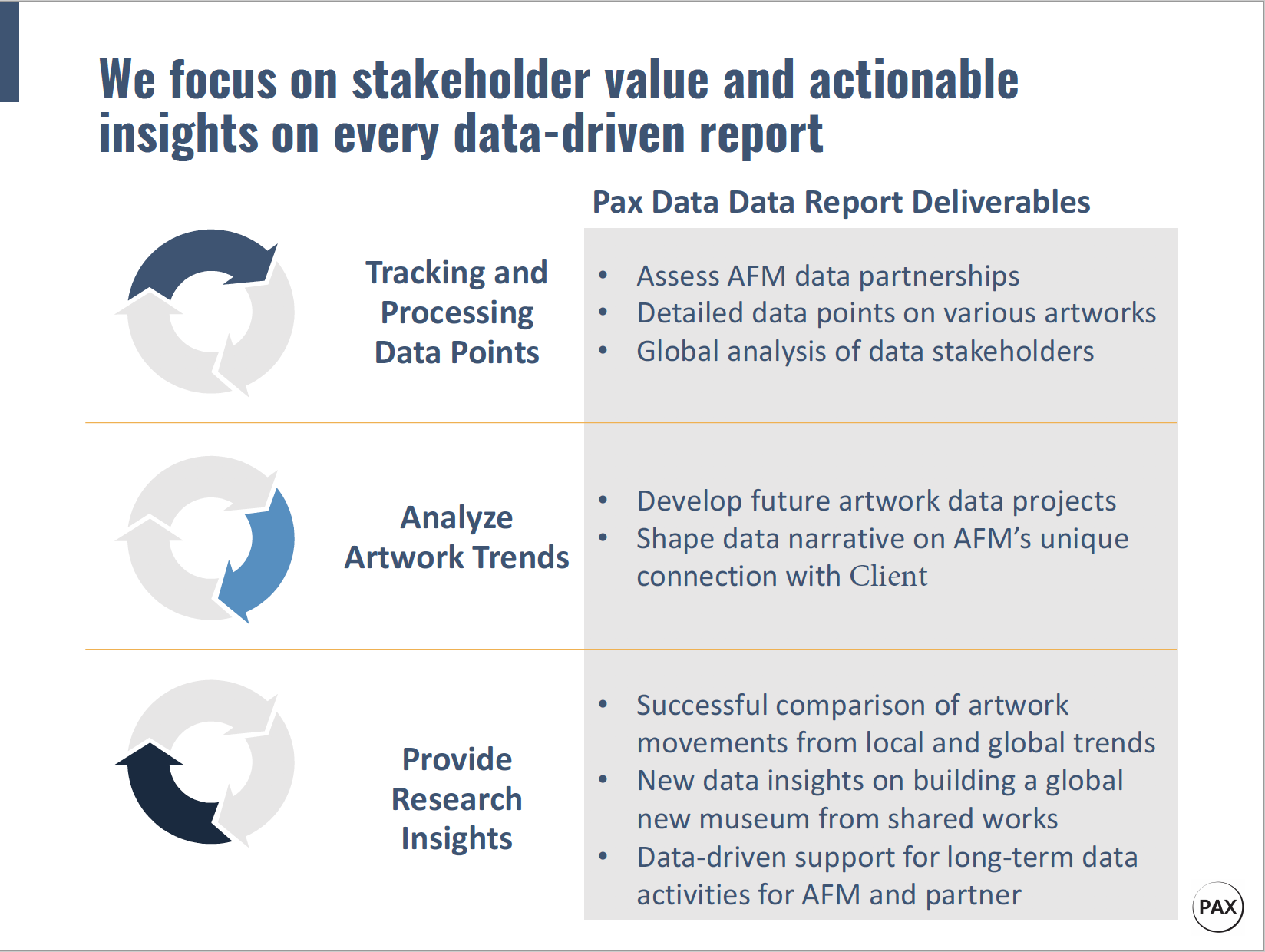
Alvarez Spark Innovation Award recipient Kwasi Agyeman spent Fall 2020 working on a data chart tool for public and social sector organizations. His project focused on using data charts as collaborative tools to address pressing issues.

Our original team plan at Pax Data was to build a data chart platform for social sector organizations to share and visualize spreadsheets. Our demo version was ready in Spring 2020 and the pandemic changed our plans. We quickly realized that the majority of public and social sector organizations did not have the capacity to start using a new online data platform. It was a challenging time for everyone and I decided to review brainstorm exercises from the Changemaker Institute program. The design criteria exercise is one of my favorites because it makes you focus on figuring out first steps for solving specific problems. This exercise helped me realize that the immediate need was not an online data platform, instead organizations needed insights on the importance of data strategy. My blog post further explains our company’s journey on building data tools for a post-COVID world.
As a Tulane student, I was shocked to discover that right here in Louisiana, about one-third of kids under the age of five years old live in poverty. That means over 100,000 children do not even have a fighting chance before the first day of kindergarten. One underfunded organization – Head Start of Louisiana is responsible for managing, processing and analyzing all the data needed to close this huge educational gap in Louisiana. Can you imagine that one person with a small team trying to deal with such a massive task? It is also a great example of the problem our company hopes to fix.

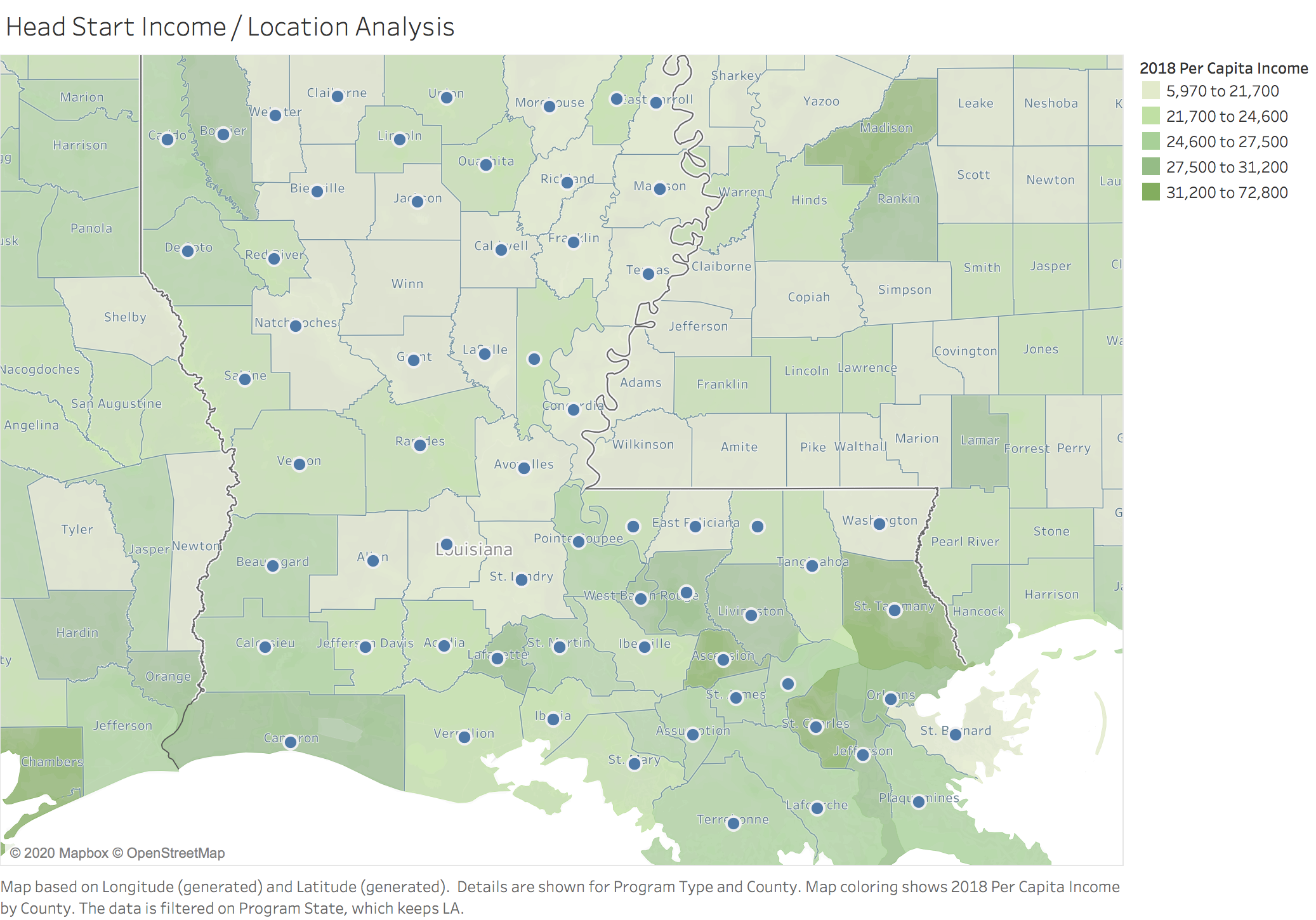
Our team at Pax Data, started prototyping data chart tools to help social enterprise teams better understand trends and factors related to pressing issues such as the state educational gap. The map below shows Head Start locations in Louisiana based on per capita. Interestingly enough, Winn Parish which is one the poorest in the state, lacks a Head Start location. This map chart can be updated based on demographic and educational attainment status. Having broad visual access to public datasets can help researchers and analysts collaborate on addressing issues such as childhood education in Louisiana.
Most people in the social sector put data in spreadsheets and they are great places to organize data. However, spreadsheets were not meant to be reviewed by varied groups for decision-making. Spreadsheets are static and it is a struggle to share data insights with others or even explain its value to external stakeholders. It’s a big global problem.
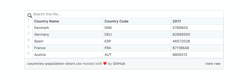
Here’s an example of a population dataset that’s difficult to fully understand just at a glance. Which country has the third largest population?
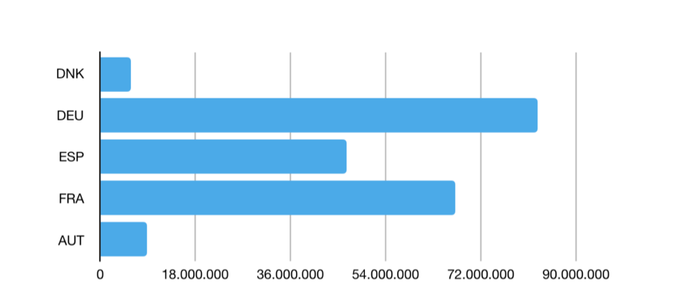
 Here’s the same data, presented as a bar chart. A simple data visualization makes it easier to figure out the third largest population.
According to our market analysis, there are over 10M social sector organizations in the world, our core focus are the 500,000 social enterprises in the U.S. Social enterprises work to fulfill their mission but they struggle to wrap their arms around all the complex pieces of data tied to that mission. Our research shows that social enterprise teams often lack data tools to process and understand their complex datasets. It often limits their ability to raise awareness and more importantly, make an impact.
Once the pandemic became a reality, we focused on the value of a social sector data chart platform to share and collaborate on large amounts of datasets with others. In the corporate sector, there are cloud-based data visualization platforms such as Tableau that help corporations be more efficient and effective. But those tools are expensive, time-intensive and often require a steep learning curve, so our team wanted to create a data chart platform that was accessible, affordable and collaborative for the public and social sector.

Our team finalized our core value propositions, target market and long-term goals based on a technology platform. It seemed like a great idea before our first case study. One of our earliest test partners was a cultural organization that struggled to understand how audience trends impacted attendance results. We taught this would be an easy fix. Get the attendance spreadsheet and past event records, upload it online and create a data chart with insights. After the first series of meetings, we realized the organization did not have a data strategy and therefore did not consistently review or analyze any past datasets collected. In this situation, a tech platform was impractical. The first step began with client training sessions on the value of data strategy. Our team started hosting feedback panels, workshops and discussions on how public and social sector organizations can develop data strategy for sustainable growth.
The data chart platform was a tech application of a data strategy method, called benchmarking. Benchmarking is when anonymous data is contributed to an aggregate data set to enable features that can help you understand data trends. All identifiable information is removed and combined with other anonymous data before it is shared with others for data insights. We developed another case study for our data chart tool, our plan was to complete a benchmarking analysis with the Louisiana Endowment for the Humanities (LEH). LEH currently manages Head Start for the state of Louisiana and is responsible for closing the educational gap in early childhood education. Our plan was to start in Summer 2020 and visualize a heavily used internal dataset that applies statewide. This project brought mixed success. Prior to the project start, the department mostly collected on paper and it was later entered in a spreadsheet by staff members, then usually analyzed by the project manager. Our surveys showed that over 80% of public and social sector professionals lack access to data insights and therefore make decisions in silos. The ideal project flow would allow all team members to share and review the data analysis chart.
Instead of building a tool to test on one organization, we built our data tools to address our test clients’ repetitive problems. The LEH contact mentioned that they struggled to gain deeper data insights on childhood education in Louisiana. Since the LEH had a mostly traditional data collection process, they collected information on paper and then later typed the information. This process isolates trends and discourages active review. it might have been best to setup regular data audits that can be shared online to stakeholders and community partners. For example, it could be a list of the top parishes that are need for educational support for second graders. Throughout our numerous case studies, we learned that a data tool can still be applied once our team has trained a core test group with our continuous products/prototypes.

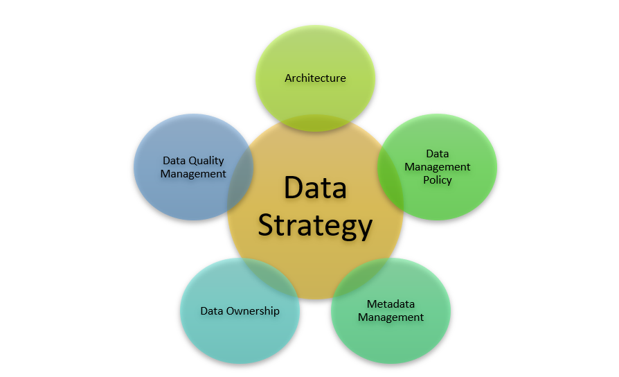
We started with an ambitious idea to build a data chart platform for public and social sector organizations to collaborate and share insights. After several case studies, we realized that though the prototype could be helpful, the majority of public and social organizations are facing tremendous pressures from the pandemic and need baseline resources to better understand data uses. Pax Data now provides data strategy services ranging from data workshops to providing insights in key areas such as data collaboration, data governance, data commercialization, data sustainability and future use of data.